
Drawing, describing and explaining graphs are really common exam questions and are questions that lots of students make mistakes on. You need to know the rules to follow when drawing and describing graphs.
Rule One: Drawing a line graph
Whenever you have finished a graph you should always check it thoroughly. Have you:
- Used a pencil and ruler
- Ensured both axes have an even scale
- Ensured both axes are labelled, with units
- Plotted every point accurately (if it is more than one small square off, it is wrong)
- Circled anomalous results
- Drawn an appropriate line of best fit – straight line or curve?
- Given your graph a title
Rule Two: Describing a trend in a graph
To describe a graph you have to discuss the pattern of the line.
There is a general sentence structure to describe a graph. You should always refer to whether the variable on the x-axis and the variable on the y-axis are increasing or decreasing.
For example:
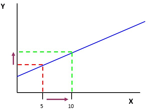
As X increases, Y increases
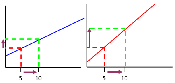
As X increases, Y increases slowly. As X increases, Y increases quickly.
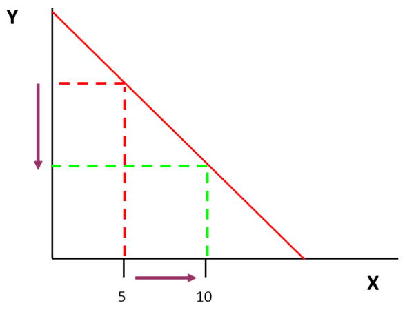
As X increases, Y decreases
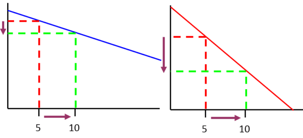
As X increases, Y decreases slowly. As X increases, Y decreases quickly
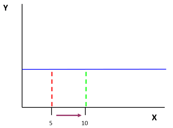
As X increases, Y stays constant
Using PEE to describe and explain the trends in graphs
Your description of a graph should discuss the pattern of the line, but also give data quotes. Your explanation of the graph says why the graph has got that shape.
You can use the PEE structure to describe and explain any trends present in a graph.
P – Point
E – Evidence
E – Explain
Example One: Describe and explain the trends in the three sections of this distance time graph.
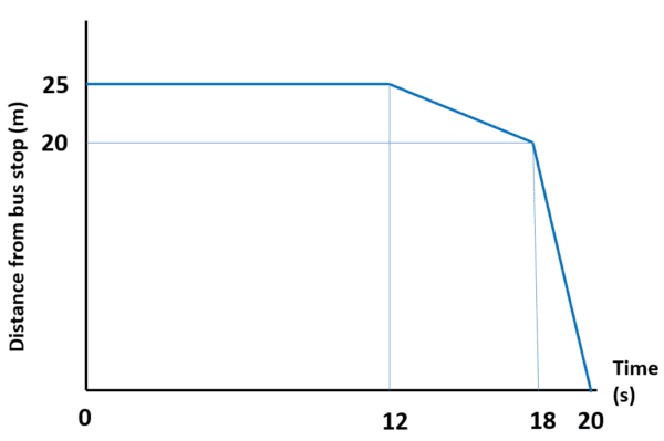
As time increases from 0 to 12 seconds, distance stays constant at 25 m.
This means that they are standing still, perhaps talking.
As time increases from 12 to 18 seconds, distance decreases slowly from 25 m to 20 m.
This means that they are moving slowly towards the bus stop.
As time increases from 18 to 20 seconds, distance decreases quickly from 20 m to 0 m.
This means that they are moving quickly all the way to the bus stop.
Example Two: Describe and explain the trends in this graph that show obesity rates in The USA.
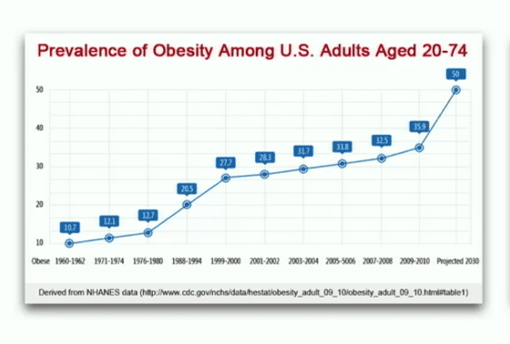
As the time increases the percentage of adults in the US who are obese also increases.
For example in 1961 10.7% were obese and in 2011 35.9% were obese.
This could be because more people are eating food high in sugar and fat and less people are exercising regularly.